TWO REBRANDS FOR COE IN LONDON
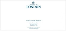
 It’s a new world out there. Gay marriage is legal (almost) in the UK, the pope is tweeting and the census says there are fewer religious people in Britain than there were 10 years ago. Standing in the face of all that is a bold redesign for the Diocese of London and the Bishop of London.
The 2011 census results, unveiled yesterday, revealed a 13% drop in people identifying as Christian. Amidst a growing number of British residents who do not have a religion, the Church of England must strengthen it’s appeal to young people. For that reason, in part, Belfast-based branding agency Paperjam has created a new visual identity for the Church of England’s presence in London. Alongside the rebranding, the Diocese and Bishop of London were formally separated into two unique brands.
The Diocese of London sought specifically to appeal to a youth audience. The new, minimalist identity will align with the history of the Diocese while maintaining the Church of England’s tone.
With a coat of arms drawn from historical tradition and a shade of red chosen to represent London, the Bishop of London brand respects tradition while bringing a sense of the 21st century to play.
“Paperjam decided to recreate a historical crest using a modern illustrative style that brings the crest up to date but at the same time reflects the heritage and authoritative qualities,” Paul Malone at Paperjam says. “The biggest challenges facing Paperjam was how do you create a modern brand while still referencing its historical roots.”


